The American Website
Whether it is short sightedness or lack of interest, I have no idea, but so far, the study of management has paid little attention to websites, even though, any small or large organisation, business, non-profit, and-or government agency needs one.
In the 1990s, a majority of managers did not bother aligning their mission and objectives with their website. It was sort of like a store owner showing off everything at the storefront: except for what they are actually selling.
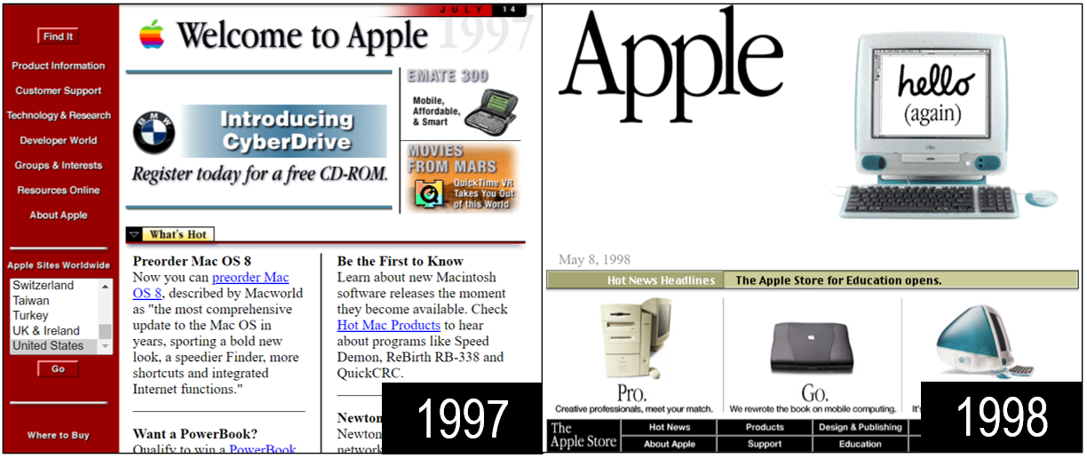
The website as we know it today, began with Apple in 1998. Its premise matched that of the iMac in that the website should be easy to navigate and user-friendly
By showing one thing at a time, Apple made their mission visible, to bring personal computing products to consumers around the world. First, it was the iPhone, then the iPod, then the AirPods. This soon ignited the imagination of other corporations who quickly followed suit.
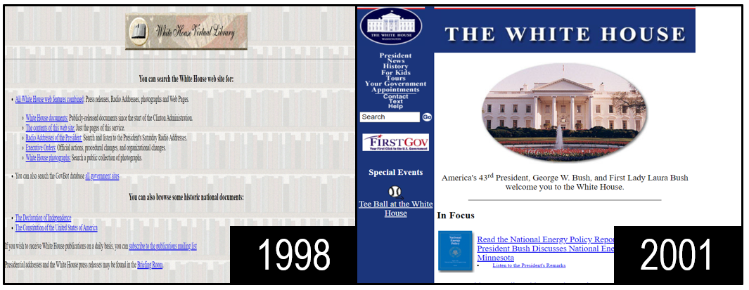
The US government was also an internet pioneer. The State Department was one of the first to use clipart effectively to communicate America’s foreign policy abroad. This was in contrast to the website of the White House. Before the introduction of social media, also known as web 2.0, the site was confusingly designed as both a library and an archive which had little to do with the actual goals of the US President.
The modern website brought with it a new strategic model. Management needed to develop a plan to achieve company results with their websites.
Only 20 years ago, users visiting the Wall Street Journal website were asked to click on their country of origin. Options were Europe, the US, and Asia. Clicking on Europe resulted in finding a Euro Currency Converter. The Asia option directed the visitor to news on China and Korea. Selecting USA, brought confusion between British and American English.
Translating a page into French, German or Hebrew is not enough. Management must ensure that a website automatically reflects a visitor’s cultural perception and liberal arts. The internet is a world with cultural diversity. It has different anthems, different weather, and different foods.
Management must do more than manage their subordinates. They must lead their users as well. Management must set and create defaults on their website. They must communicate their mission to six different continents, ideally in six easy-to-understand, user-friendly ways. This is what the American corporation has always done – and this is what the American Website must learn to do now.


